Friday 11 December 2015

Billboard magazine

Billboard magazine-


The style of my magazine will be focused around the design of billboard, they’re one of the only magazines who do not have an ongoing cover, and however the conventions are usually the same. For example, they focus the colour scheme of the magazine on the model for the main image, if someone like Katie Perry was used, it would mean the cover would be focused on pinks and reds, this highlights she is a girly girl and has the star image of a everything pink and glamorous girl. I like this as it makes the magazine personal and different for every read, this allows people who collect it to then range with a collection and also, like characters in books, the colours give an identity to the artists.

I will be using a female artists, so for my colour scheme I will have to make sure it fits within her star image and promotes her as the pop star she is and make sure it does not contrast against her. I will be using greys, whites, silver, black, and light pink. This will show her as an urban girly girl who isn't based at younger audiences but more older ones.
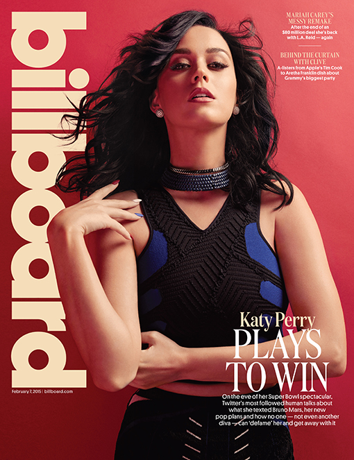


These two covers have been taken from different months; however they both remain with the same model for the main image. Also the colour schemes are ultimately similar; the first one consists of reds and pale camel colours and black. The second one has a main colour of pink; however it includes black and light camel colours and even red. This allows the magazine to provide artists with their own personal covers and make them identifiable by the colours. This allows audiences to be able to relate colours to artists and provides the artist with something to add to their star image, promoting them further.


Genre-

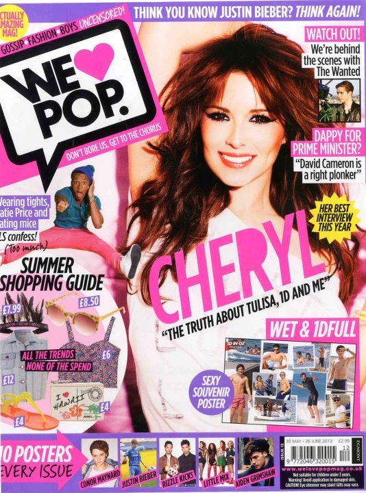
The genre of Billboard magazine is mainstream music. For example it focus' on artists that would appear in the official top 40, which is aired on Capital Radio every Sunday afternoon. They range from pop, to R&B, to hip hop. The artists are normally ones who appeal to everyone in some way and appear in the the public eye often. For example, Chris Brown, Justin Bieber, One Direction, Taylor Swift , Beyonce.  So I will focus on creating a generic pop star, who is appealing and what every girl ants to be now or when they're older.

Thursday 10 December 2015

Initial Ideas

Initial ideas-


After researching different magazine genres, I have decided to base my magazine on the magazine ‘Billboard’ which is focusing on hip hop, R&B, and hip hop. They generally take their models from the official top 40 chart. I have frequently brought magazines like ‘We love pop’ as a young teen and I would like to base my music on the 17+ audiences who appeal to this genre. I will look further into the Billboard magazine and research into the different types of people who fit into these genres. Using social media I will be able to look further into the three different themes I am focusing on and be able to see what they like or don’t like and things they would prefer in the magazine and also things they would not like at all.
After researching these genres a mix of female and male models are variously used, I will use similar conventions to the billboard magazine and focus on a female model for my cover, I will also include male models within the contents to show variation and representation of the genre. I enjoy this genre very much and know a lot about the people frequently involved; this will help me very much as due to being interested in this genre I will know the typical wants and needs to the audience.


Possible names-

Duson (sound in French)
Official
Unico (unique in Italian)

Genre-
Pop/R&B/Hip Hop

I have chosen these genres as it is the most known and up to date genres about, these three genres also intertwine together and overlap to complement one another. I also feel as though this is a well read about subject and would catch my target audiences eyes. Also due to being a fan of these genres I am able to include things I as a fan would prefer within the magazine. I feel as though I will be able to complete my magazine to the best of my ability as I have pre knowledge, this will help influence my ideas further after doing deeper research. I also have many ideas for photoshoots and colour schemes.

House style-

House style is when a magazine consists of a consistent layout and structure, this includes colour, logos and schemes, House style allows magazines to have a specific layout and look.  For my magazine I will be using an ongoing colour scheme and fonts to help the magazine all tie together. The billboard magazine uses mostly dark backgrounds and lighter plain fonts. Whereas magazines based around genres like rock are normally white, red and black. My masthead will be placed in the exact position throughout every issues, this will give my magazine its very own identity and allow it to stay known to audiences.

Star image-

For my cover I will be using a female model, I will design her to look like a pop star who is seen in the media very often, I will make her look sophisticated and mature yet glamorous and fun, This will give her an almost ‘perfect’ look to her in which many girls will aspire too. Using props I will be able to give off a lot of detail about her and the things she likes and is in too, for example makeup and clothes, I will make sure my artist reflects on the theme and coveys from the outset what genre she is focused upon.

How frequently will my magazine be published?

Due to music being an ongoing market, I will release my magazine monthly; this will allow time for new music to be released and allow my magazine to be filled with the latest and updated news within the genre. Also this is useful as it will allow me to edit my magazine to its very best in time for its release each month. Having it released monthly will also means it becomes known due to the audience knowing that they need to buy the magazine every month. I will price it at 3-6 pound. I am more thinking of £4.99, as I am hoping my magazine can be set up with some of the biggest artists around.


Sunday 1 November 2015

Colour

The colour wheel is a product which is placed in terms of colours chromatic relationships.  When making a magazine the idea is to make it eye catching, and pleasing to the reader to want to look at. Using harmonising colours allows the designer of the magazine to create exactly want the audience look for, it also allows the magazine to have its very own colour scheme which most magazines take in and us for every issue, this means when those colours are present customers automatically think of that particular magazine. Using opposite colours creates an unpleasing cover and makes it look very messy and not appealing to the reader. So the colour wheel helps us avoid any problems with colour.
The colour wheel is made up of three main sections:

Primary Colours: These are the three colours in which start the base of every over colour, these can not be made up by any other colour, these are Red, Blue, Yellow.

Secondary Colours: These colours are made up by mixing two Primary Colours together, these are Green, Purple and Orange.

Tertiary Colours: These are made up of mixing a Primary Colour and a Secondary Colour together. The Primary colour is normally the main colour used at a ratio of 2:1.


These sections are then separated into even smaller sections. Warm Colours, Cold Colours, Harmonising Colours, Complementary  Colours, Contrasting Colours, Netural Colours.

Cold colours
The colour wheel can be split into two parts, cold and warm colours. Cold colours are usually blues, greens, and purples. These all sit in this area as they as very dark and dull and are usually associated with cold places mentally through nature. These colours do not mix well with warm colours are they are complete contrasts. Magazines based on nature or home furnishing normally use dark colours as they are neutral.


Warm Colours.
Warm colours are extremely vibrant and bright they consist of red, yellows and oranges. They are usually within Pop and younger target audience magazines as they are loud and exciting making the magazine look more interesting and fun. Due to being bright they usually cancel out cold colours and 
make them look odd within the magazine and do not ,mix well. 

Harmonising Colours.
These colours are next to one another on the colour wheel, these are colours that are likely to go together and create a aesthetically pleasing look as they compliment each other.
E.g Red & Purple
Yellow & Orange
Blue & Green

Complementary Colours.
These colours are located opposite each other on the colour wheel , these colours are used to make things look vibrant, they have to be used carefully as they may create an annoying and ugly effect. These colours are not good for text.


Contrasting Colours.
These are colours that do not fit within any of the same categories, for example blue and yellow would not work well together unless certain tones were chosen and they were used extremely carefully. The blue is a cold colour and the yellow a warm, the blue would look very dull and the yellow would over take this with its vibrancy. Also red and green contrast as they are so far apart from one another on the colour wheel, The further away the more contrasting the colours are set to be and not look well together.

Neutral Colours.
These colours are ones such as grey, black, white, beige, camel and ivory. These are very subtle colours and have many undertones, for example camel, would be made of yellow and brown and then added white to lighten it to create the camel. Ivory is majority white with a hint of yellow in it, Beige may have an undertone of pink or gold which can cause the colour to have a different looks so you have to be careful when choosing other colours to go with them and make sure you check the undertones.


Typography

Typography is the technique of arranging text to make written language more readable, appealing. legible and interesting for the reader. For example this could include a range of spacing, shaping. point size, line length, line spacing, letter spacing and positioning text to form photo. Many companies use this as it makes whatever they are trying to advertise eye catching and makes the target audience attracted to their product. Also typography allows you to see what the text is mainly focused on, e.g starbucks, made their advertisement of the product making the text into a coffee cup.


Typography started in 1850 - 1600 BC and originated in Greece. They started by using it for punches and dyes used to make currency. Back then typographers used to press disks into desks of language symbols which they would then press onto paper or something they wanted the print to be on, this was called Phaistos Disk. It then evolved into a whole new industry and became a big part of media and advertising.


Mcdonald's have used typography here to advertise their mcflurry's, the use of the mcflurry as the O and then using its ingredients as the other letters allows the target audience to be tempted. They have made the typography into a name which makes it very personal to someone within the audience, they made many of there adverts with different names. 

Image result for typography in advertising
Converse have also used typography to advertise their product, they have made their words into the shape of a shoe. The words are very easy to read and lead your eyes along the photo. The words are related to the product and make the audience want to buy it.

Friday 16 October 2015

What is a music magazine?

A music magazine is a magazine which is made around music style, and music culture. These normally include latest music, music interviews, sneak peaks of future albums, photoshoots, concert and gig reviews. They are normally laid out around one band or singer in which was interviewed. Music magazines are individual and intimate to the reader, they relate to something you are interested in and normally something you know a lot about. They allow the reader to be educated further and kept up to date with the chosen subject. The creator of the magazine usually uses colours related to the magazine genre to then attract the reader and make the eye-catching to that theme. For example rock magazines are usually made using red, black, golds and whites to make them dark and mature then this allows the target audience to relate to it and know that magazine is made for them and their music taste. Where as pop magazines normally use bright colours like pink, blue, purple and yellow.


Music magazine genres compared?

Music magazines come in many different genres. I have been looking into different magazine genres and getting inspiration for them for my own magazine I have looked at R&B, Pop and Hip Hop. I have been comparing the differences and similarities, their target audiences, how they are set out their colour themes and which one I would prefer to base my magazine around. 


R&B

The majority of R&B magazines are either scary and dark, or extremely bright. The master head always stands out against the background, however the photograph always takes up the majority of the background. They use a large main image and it always relates to the main article within the magazine. The audience they are trying to grab attention from is teenagers and young adults; they are always up to date and in focus with the latest R&B gossip.


This magazine is taken from google images after i typed in 'R&B' magazines. The title is large and bold and the red contrasts against the white background. A photo of Beyonce has taken up most of the page and a cover line is to the left of her directing your eyes to her name which is one of the few words in black. This magazine shows a typical R&B theme and allows you to see the audience from the start.


POP

Pop magazines are generally bright coloured and although they use contrasting colours it is carefully laid out allowing them not to lash and make the magazine unpleasing to the eye. They normally use pink and purples turning their target audience to the female audience but mostly teenage girls. The main image on the magazine is usually a new or popular POP singer and is normally someone the target audience would be interested in. The master head is usually bold and in bubble writing or some magazines have their titles in shapes etc. hearts or stars. The language used in the magazine is normally simple and fun to read, the cover lines are short and snappy and allow you to have an idea on the articles without reading too much. Also they normally have more than one photo on the magazine cover, with a main image still centred. 


This magazine has been taken from google after typing in 'Pop magazine'. It was the first image that appeared from the search. The title is within a speech bubble and looks like text talk and to the left of the magazine. The main image is to the right of the magazine and the coverline related to it has been put across the middle of the photo. The singers name is larger than the masthead and is eye catching to the audience. There is many photos plastered over the cover with small cover lines with a few words giving slight details. This shows the target audience what is within the magazine and makes them want to buy it. The more photos allows the magazine to be an easier read. 


Hip Hop

Hip Hop magazines are generally very masculine and grunge, they use dark colours like red and black and occasionally white and grey is used. The main photo is generally a male singer or rapper who looks angry or straight faced with no expression. Most of the mastheads are in red or white and are across the top and covered in the middle by the main image or to the left of the magazine ending where the main image starts. The cover lines are bold and spread out around and slightly across the main image. They usually consist of the latest hip hop gossip and titles of albums and interviews with the most famous artists. The artists used are normally ones who have been around for a while and have made it big within the industry.


This is a hip hop magazine I have taken from Google images. The title is white and within a red border, it is in capitals and short and bold. The main cover photo is very intimidating and the models look angry as they do on most hip hop magazine covers. The cover lines are also short and bold, they say the names of the main people involved in the stories rather than a short introduction. This is very aimed at an audience of men as they are male rappers rather than singers who live appealing lifestyles to other males.

Mode of Address

Mode Of Address is the way in which the media communicates with the audiences and expresses itself, for example how a magazine is presented to an audience.
Mode Of Address can be in 1st, 2nd or 3rd person, direct address is mainly used as it is specifically directed at the audience and is as though it is just to them personally.
Also formal and informal is a mode of address, formal is more likely to be used in classical music magazines, whereas informal would be in pop magazines.
Colloquial language would be used in informal magazines and it is quirky and easy to read. Expletive language is likely to be used in rap and hip hop magazines as this is where swearing is more than likely to occur.


Tuesday 13 October 2015

Introduction

Hello my name is Ellie and in this blog I will post my progress and development of my music magazine I will be making for my AS level media.
This is the link to my school magazine which I used to help me get with the basis of a creation of a magazine - http://elottschoolmagazine.blogspot.co.uk/
I used photoshop and picmonkey to create my school magazine. I experimented with different photo's,fonts, layouts and a range of effects and edits. When making my music magazine I will now have more skills a I have had time to go through reach programme when making my school magazine, hoping to ensure my magazine is to the best of my ability. 

For my music magazine I will research different genres from, pop, rock, rock pop, rap, hip hop and many more. I will do this by reading and researching the different magazines and looking at their at conventions and comparing them until I choose one to make my own of. At the end of my research I will have a clear idea of music magazines and how they work.