A music
magazine is a magazine which is made around music style, and music culture.
These normally include latest music, music interviews, sneak peaks of future
albums, photoshoots, concert and gig reviews. They are normally laid out around
one band or singer in which was interviewed. Music magazines are individual and
intimate to the reader, they relate to something you are interested in and
normally something you know a lot about. They allow the reader to be educated
further and kept up to date with the chosen subject. The creator of the
magazine usually uses colours related to the magazine genre to then attract the
reader and make the eye-catching to that theme. For example rock magazines are
usually made using red, black, golds and whites to make them dark and mature
then this allows the target audience to relate to it and know that magazine is
made for them and their music taste. Where as pop magazines normally use bright
colours like pink, blue, purple and yellow.
Music magazine genres compared?
Music
magazines come in many different genres. I have been looking into different
magazine genres and getting inspiration for them for my own magazine I have
looked at R&B, Pop and Hip Hop. I have been comparing the differences and
similarities, their target audiences, how they are set out their colour themes
and which one I would prefer to base my magazine around.
R&B
The majority
of R&B magazines are either scary and dark, or extremely bright. The master
head always stands out against the background, however the photograph always
takes up the majority of the background. They use a large main image and it
always relates to the main article within the magazine. The audience they are
trying to grab attention from is teenagers and young adults; they are always up
to date and in focus with the latest R&B gossip.

This magazine is taken from google images after i typed in 'R&B' magazines. The title is large and bold and the red contrasts against the white background. A photo of Beyonce has taken up most of the page and a cover line is to the left of her directing your eyes to her name which is one of the few words in black. This magazine shows a typical R&B theme and allows you to see the audience from the start.
POP
Pop magazines
are generally bright coloured and although they use contrasting colours it is
carefully laid out allowing them not to lash and make the magazine unpleasing
to the eye. They normally use pink and purples turning their target audience to
the female audience but mostly teenage girls. The main image on the magazine is
usually a new or popular POP singer and is normally someone the target audience
would be interested in. The master head is usually bold and in bubble writing
or some magazines have their titles in shapes etc. hearts or stars. The
language used in the magazine is normally simple and fun to read, the cover
lines are short and snappy and allow you to have an idea on the articles
without reading too much. Also they normally have more than one photo on the magazine cover, with a main image still centred.
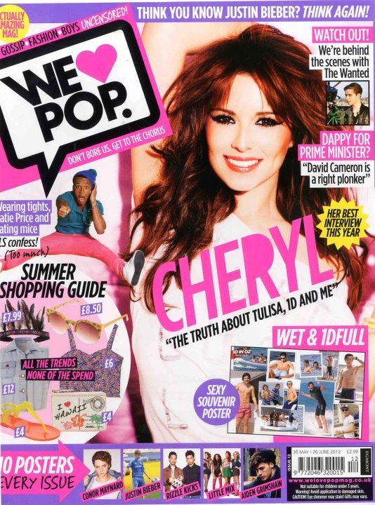
This magazine has been taken from google after typing in 'Pop magazine'. It was the first image that appeared from the search. The title is within a speech bubble and looks like text talk and to the left of the magazine. The main image is to the right of the magazine and the coverline related to it has been put across the middle of the photo. The singers name is larger than the masthead and is eye catching to the audience. There is many photos plastered over the cover with small cover lines with a few words giving slight details. This shows the target audience what is within the magazine and makes them want to buy it. The more photos allows the magazine to be an easier read.
Hip Hop
Hip Hop
magazines are generally very masculine and grunge, they use dark colours like
red and black and occasionally white and grey is used. The main photo is
generally a male singer or rapper who looks angry or straight faced with no expression.
Most of the mastheads are in red or white and are across the top and covered in
the middle by the main image or to the left of the magazine ending where the
main image starts. The cover lines are bold and spread out around and slightly across
the main image. They usually consist of the latest hip hop gossip and titles of
albums and interviews with the most famous artists. The artists used are
normally ones who have been around for a while and have made it big within the
industry.
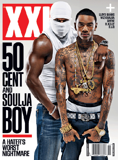 This is a hip hop magazine I have taken from Google images. The title is white and within a red border, it is in capitals and short and bold. The main cover photo is very intimidating and the models look angry as they do on most hip hop magazine covers. The cover lines are also short and bold, they say the names of the main people involved in the stories rather than a short introduction. This is very aimed at an audience of men as they are male rappers rather than singers who live appealing lifestyles to other males.
Mode of Address
This is a hip hop magazine I have taken from Google images. The title is white and within a red border, it is in capitals and short and bold. The main cover photo is very intimidating and the models look angry as they do on most hip hop magazine covers. The cover lines are also short and bold, they say the names of the main people involved in the stories rather than a short introduction. This is very aimed at an audience of men as they are male rappers rather than singers who live appealing lifestyles to other males.Mode of Address
Mode Of Address is the way in which the media communicates
with the audiences and expresses itself, for example how a magazine is presented to an audience.
Mode Of Address can be in 1st, 2nd or 3rd person, direct
address is mainly used as it is specifically directed at the audience and is as
though it is just to them personally.
Also formal and informal is a mode of address, formal is
more likely to be used in classical music magazines, whereas informal would be
in pop magazines.
Colloquial language would be used in informal magazines and
it is quirky and easy to read. Expletive language is likely to be used in rap
and hip hop magazines as this is where swearing is more than likely to occur.
No comments:
Post a Comment